最新动态

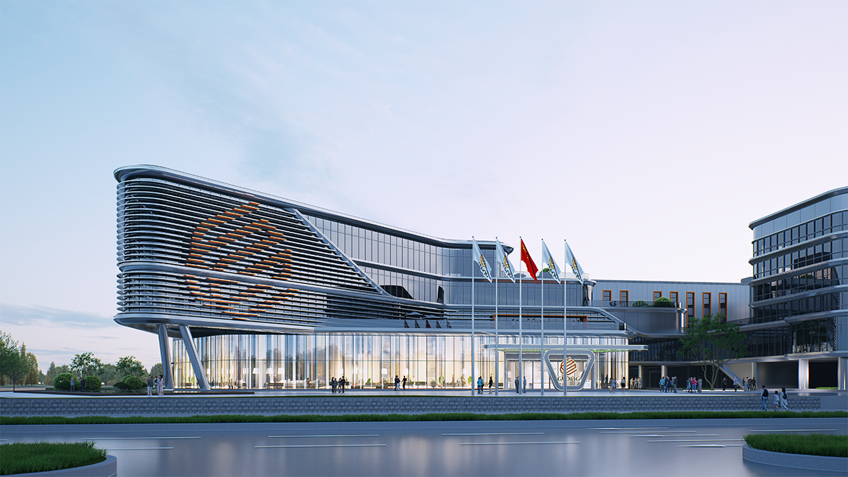
"大多数工厂的立面,是建筑史上'被遗忘的面'——功能主义的灰色盒子,能遮风挡雨就行。但在福建福州,一家电机企业给出了另一个答案:把企业LOGO的曲线提炼出来,'绣'在十万平米的工业园立面上,让生产区呈现'龙腾飞跃'的动态意象。品牌,第一次成为建筑的题眼。"
这家企业,是巨龙电机有限公司。这座园区,是总建筑面积超10万平方米的智慧工业园——大驰创新担纲设计,目前处于设计深化阶段。
一、立面为什么值得认真对待?
先看一个被多数企业家忽略的事实。
一家制造企业的厂房立面,平均每天被多少人看见?通勤的员工、来往的供应商、路过的车辆、来访的客户、空中的航线——一座工业园区,保守估计每天向数千双眼睛免费展示自己的形象,一年365天,从不休息。
而多数企业为这笔"免费的广告位"花了多少预算?接近零。外墙涂料、标准门窗、工业化单元——能省则省。
但立面传递的信息不会缺席:它要么在说"这是一家有追求的企业",要么在说"这是一家只看眼前的企业"。巨龙电机的选择,是把这笔免费的账,认真算到底。
二、三道立面题,一个品牌解法
大驰团队在设计上先把园区拆成三道题:
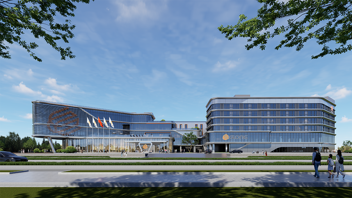
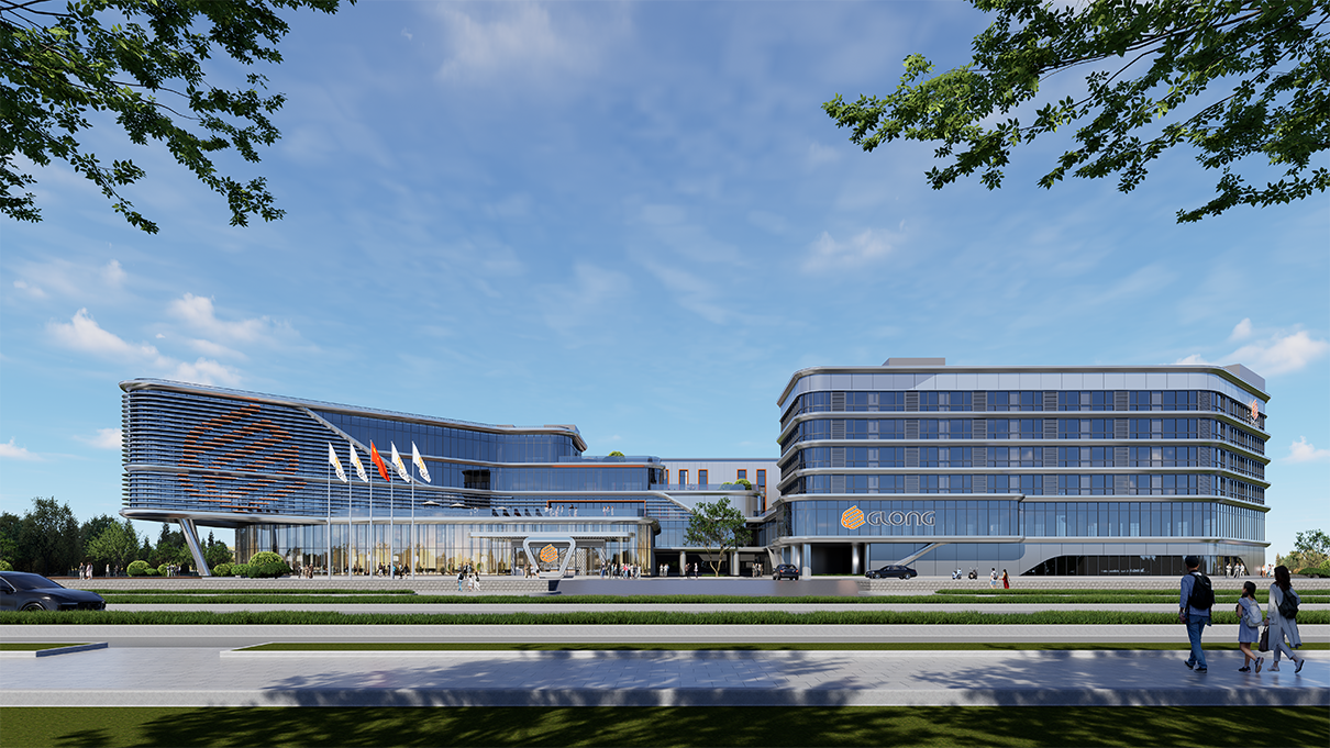
第一道题:办公区。 行政办公楼是访客进入园区的第一接触面,采用铝板与玻璃幕墙,搭配活泼的黄灰主色调——传递的是电机企业的精密与活力,而不是传统工厂的沉闷。
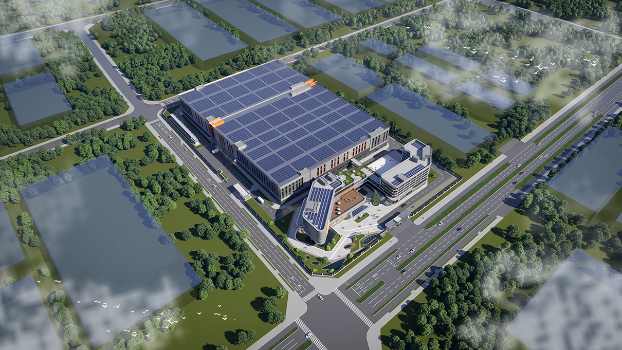
第二道题:生产区。 大型厂房最容易沦为单调的"盒子"。设计用水平线条与虚实对比做节奏,塑造"龙腾飞跃"的动态意象——厂房不再是静态的背景,而是有方向感、有速度感的品牌图腾。
第三道题:品牌植入。 这是最关键的一步——立面语言提炼自企业LOGO的曲线元素,并巧妙融入"GLONG"标识与品牌橙。走近园区,你读到的不是一排厂房,而是放大了一千倍的企业名片。
三道题,同一个解法:让建筑的每一片墙面,都成为品牌DNA的载体。
三、为什么是"曲线"?一道翻译题
好的品牌可视化,从来不是把LOGO贴上去那么简单——那是"贴标签",不是"翻译"。
这道题的真正难点在于:电机的品牌内核,如何翻译成建筑语言?
电机的本质是旋转——是线圈与磁场之间永不停歇的圆周运动。大驰团队抓住的正是这个"圆"与"动":LOGO的曲线,是旋转的抽象;立面的水平线条与起伏节奏,是动力的具象。品牌DNA没有被贴在墙上,而是长在了建筑里。
这就是大驰"品牌可视化"方法论的核心:不是给企业穿一件印满Logo的外套,而是把品牌的基因,编进空间的骨血。
这套方法论背后,是大驰创新96个项目、横跨二十多个细分行业的实践积累——89.4%的项目采用11步标准化流程管理,确保品牌叙事与工艺、规划、建筑在同一套坐标系里被认真对待。
四、立面之外:一座园区的完整答卷
当然,一座园区不能只有立面。巨龙电机智慧工业园的设计答卷是完整的:
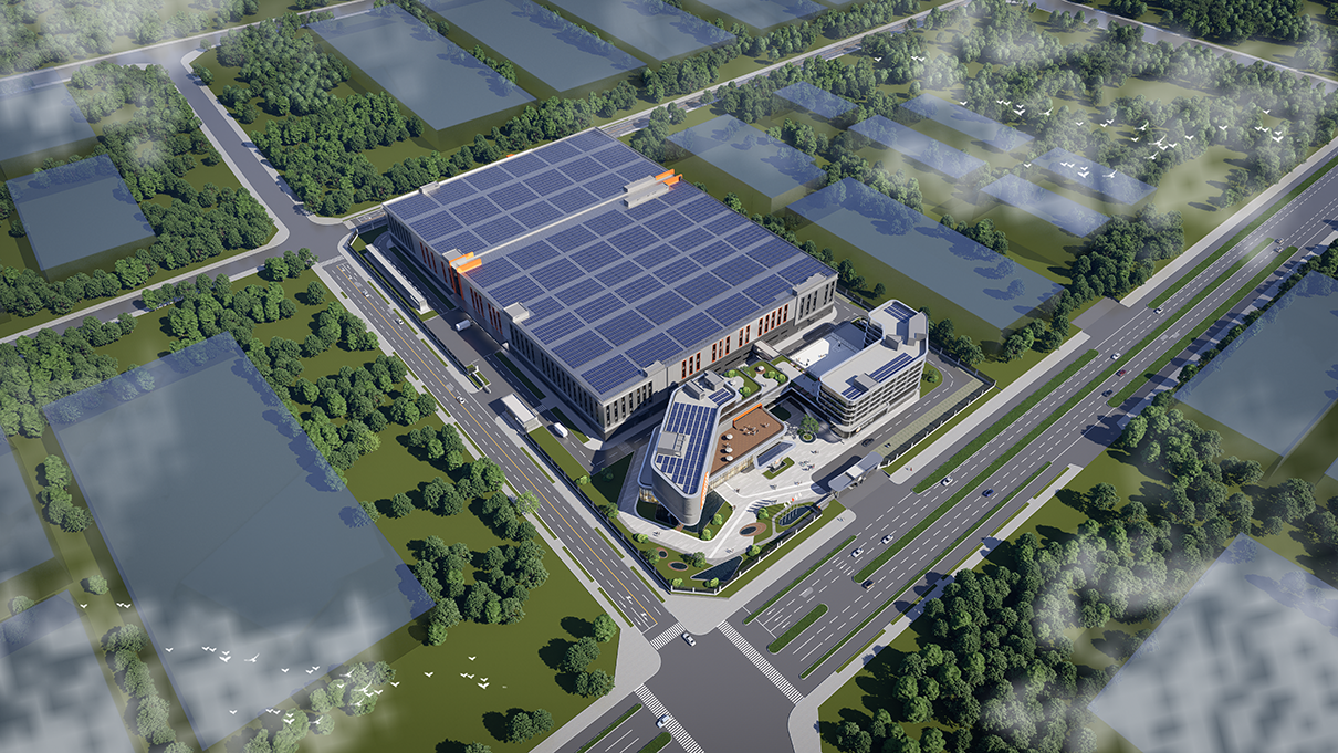
功能上:大型生产厂房、行政办公楼与配套设施一体规划,集制造、办公与生活配套于一体,是电机制造领域的现代化标杆园区
低碳上:屋顶大面积铺设光伏系统,把厂房最大的"闲置资产"——屋面,变成绿色电站,贯彻低碳绿色规划理念
统筹上:道路与景观绿化整体规划,兼顾高效生产与总部形象——货运流线的效率与园区的脸面,一个都不能少
立面是题眼,但不是全部。好看、好用、好绿色,这道题才答完。
五、写在最后
回到那个"被遗忘的面"。
中国制造业的品牌升级,过去十年把钱花在了展会、广告和渠道上——这些是"租来的注意力",按天计费。而厂房立面是"买来的资产",一次投入,终身免费展示。
巨龙电机的设计故事提醒我们:品牌的最高境界,不是到处出现,而是站在那儿,让人无法忽视。
大驰创新创始人张驰常说:"工厂就是你最大的广告牌。"而巨龙电机的案例补了一个注脚——
广告牌不必挂在路边。当你的立面会"念"品牌的名字,整座园区,都是你的广告。
FAQ
Q1:立面设计投入大吗?会不会华而不实? A:恰恰相反。立面是"一次投入、终身免费"的品牌资产——每天向员工、客户、供应商、路人展示企业形象,按曝光量折算,性价比远高于付费广告。大驰的做法是功能与美学同步:光伏屋顶、保温立面这类"实用件"与品牌语言一体化设计,不白花一分钱。
Q2:品牌可视化就是多贴几个Logo吗? A:不是。贴Logo是"贴标签",真正的品牌可视化是"翻译"——把品牌的基因(如巨龙电机的旋转与动力)提炼成建筑语言(曲线与动态线条),让品牌长在空间里。大驰在96个项目中总结的11步流程,品牌叙事从策划阶段就与工艺、规划并行。
Q3:中小企业适合做工立面的品牌表达吗? A:适合,且性价比更高。中小企业品牌预算有限,厂房立面是成本最低的品牌触点。不必一开始就做巨龙电机这样的系统表达——从主入口、形象面开始,让建筑替企业说话,是"小预算、大声量"的典型路径。
Stitching the Logo onto the Facade: A Motor Manufacturer's Park Experiment in Fuzhou
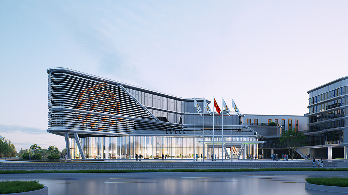
"For most factories, the facade is architecture's 'forgotten surface'—a functionalist gray box, adequate as long as it keeps out wind and rain. But in Fuzhou, Fujian, a motor manufacturer offers another answer: extract the curves of the corporate logo and 'stitch' them onto the facade of a 100,000-square-meter industrial park, letting the production zone present a dynamic image of 'a dragon soaring upward.' For the first time, brand becomes the very point of the architecture."
This company is GLong Motor Co., Ltd. This park is a smart industrial park with a total floor area exceeding 100,000 square meters—designed by DACH Innovation, currently in the design development stage.
I. Why Deserves the Facade Serious Attention?
First, look at a fact most entrepreneurs overlook.
How many eyes see a factory facade every day? Commuting employees, visiting suppliers, passing vehicles, incoming clients, even flight paths overhead—a conservative estimate puts thousands of daily viewers in front of an industrial park's image, 365 days a year, without rest.
And how much budget do most companies allocate to this "free advertising space"? Close to zero. Exterior paint, standard windows, industrialized units—save wherever possible.
But the message a facade sends never goes missing: it either says "this is a company with ambition," or it says "this is a company that only sees as far as today." GLong Motor's choice is to take this free ledger seriously—all the way.
II. Three Facade Questions, One Brand Solution
In design, the DACH team broke the park into three questions:
Question one: the office zone. The administrative building is the visitor's first contact surface. Aluminum panels and glass curtain walls carry a lively yellow-gray palette—conveying the precision and vitality of a motor company, not the gloom of a traditional factory.
Question two: the production zone. Large workshops are most prone to becoming monotonous "boxes." The design uses horizontal lines and solid-void contrast to create rhythm, shaping the dynamic image of "a dragon soaring upward"—the workshops are no longer a static backdrop, but a brand totem with direction and speed.
Question three: brand integration. This is the most critical step—the facade language is distilled from the curves of the corporate logo, subtly incorporating the "GLONG" identity and brand orange. Approaching the park, what you read is not a row of workshops, but a business card magnified a thousand times.
Three questions, one solution: let every wall of the building become a carrier of the brand's DNA.
III. Why "Curves"? A Translation Problem
True brand visualization is never as simple as pasting on a logo—that is "labeling," not "translation."
The real difficulty of this problem: how does the brand core of a motor manufacturer translate into architectural language?
The essence of a motor is rotation—the endless circular motion between coils and magnetic fields. What the DACH team captured is precisely this "roundness" and "motion": the curves of the logo are an abstraction of rotation; the horizontal lines and undulating rhythm of the facade are a concrete expression of power. The brand DNA is not pasted onto walls—it grows into the building itself.
This is the core of DACH's brand visualization methodology: not dressing a company in a logo-covered jacket, but weaving the brand's genes into the bloodstream of space.
Behind this methodology lies the accumulated practice of 96 projects across more than twenty subdivided industries—89.4% of projects run under an 11-step standardized process, ensuring that brand narrative is taken seriously in the same coordinate system as process, planning, and architecture.
IV. Beyond the Facade: A Complete Answer for the Park
Of course, a park cannot live on facade alone. GLong Motor's smart industrial park delivers a complete answer:
Functionally: large production workshops, administrative offices, and amenities are planned as one—a modern benchmark park for motor manufacturing, integrating manufacturing, office, and living support
Low-carbon: photovoltaic systems cover the rooftops extensively, turning the plant's largest "idle asset"—the roof—into a green power station, implementing low-carbon planning
Coordination: roads and landscape greenery are planned holistically, balancing efficient production with headquarters image—both the efficiency of freight routes and the face of the park matter
The facade is the point—but not the whole answer. Beautiful, functional, and green: only then is the question fully answered.
V. Closing
Back to that "forgotten surface."
China's manufacturing brand upgrade has spent the past decade on trade shows, advertising, and channels—these are "rented attention," billed by the day. A factory facade, by contrast, is "purchased equity": one investment, free display for life.
The GLong Motor design story reminds us: the highest state of a brand is not to appear everywhere, but to stand there—impossible to ignore.
Zhang Chi, founder of DACH Innovation, often says: "Your factory is your biggest billboard." The GLong Motor case adds a footnote—
The billboard doesn't have to hang by the roadside. When your facade can "speak" the brand's name, the entire park is your advertisement.
FAQ
Q1: Is facade design expensive? Is it all show and no substance? A: Quite the opposite. A facade is a "one-time investment, lifetime free" brand asset—showcasing the corporate image daily to employees, clients, suppliers, and passersby. By exposure, its cost-effectiveness far exceeds paid advertising. DACH's approach integrates function and aesthetics: "practical" elements like photovoltaic roofs and insulated facades are designed in one system with the brand language—no wasted spending.
Q2: Is brand visualization just about pasting on more logos? A: No. Pasting logos is "labeling." True brand visualization is "translation"—distilling the brand's genes (like GLong Motor's rotation and power) into architectural language (curves and dynamic lines), letting the brand grow into the space. DACH's 11-step process, distilled from 96 projects, runs brand narrative in parallel with process and planning from the strategy stage.
Q3: Is facade brand expression suitable for SMEs? A: Suitable—and more cost-effective. SMEs have limited brand budgets, and factory facades are the lowest-cost brand touchpoint. There is no need to start with a full system like GLong Motor's—beginning with the main entrance and image face, letting architecture speak for the company, is a classic "small budget, loud voice" path.